');mask-image:url('data:image/svg+xml;utf8, ');mask-mode:alpha;-webkit-mask-position:center;mask-position:center;-webkit-mask-repeat:no-repeat;mask-repeat:no-repeat;-webkit-mask-size:contain;mask-size:contain}}:root :where(.wp-block-image.is-style-rounded img,.wp-block-image .is-style-rounded img){border-radius:9999px}.wp-block-image figure{margin:0}.wp-lightbox-container{display:flex;flex-direction:column;position:relative}.wp-lightbox-container img{cursor:zoom-in}.wp-lightbox-container img:hover+button{opacity:1}.wp-lightbox-container button{align-items:center;-webkit-backdrop-filter:blur(16px) saturate(180%);backdrop-filter:blur(16px) saturate(180%);background-color:#5a5a5a40;border:none;border-radius:4px;cursor:zoom-in;display:flex;height:20px;justify-content:center;opacity:0;padding:0;position:absolute;right:16px;text-align:center;top:16px;transition:opacity .2s ease;width:20px;z-index:100}.wp-lightbox-container button:focus-visible{outline:3px auto #5a5a5a40;outline:3px auto -webkit-focus-ring-color;outline-offset:3px}.wp-lightbox-container button:hover{cursor:pointer;opacity:1}.wp-lightbox-container button:focus{opacity:1}.wp-lightbox-container button:focus,.wp-lightbox-container button:hover,.wp-lightbox-container button:not(:hover):not(:active):not(.has-background){background-color:#5a5a5a40;border:none}.wp-lightbox-overlay{box-sizing:border-box;cursor:zoom-out;height:100vh;left:0;overflow:hidden;position:fixed;top:0;visibility:hidden;width:100%;z-index:100000}.wp-lightbox-overlay .close-button{align-items:center;cursor:pointer;display:flex;justify-content:center;min-height:40px;min-width:40px;padding:0;position:absolute;right:calc(env(safe-area-inset-right) + 16px);top:calc(env(safe-area-inset-top) + 16px);z-index:5000000}.wp-lightbox-overlay .close-button:focus,.wp-lightbox-overlay .close-button:hover,.wp-lightbox-overlay .close-button:not(:hover):not(:active):not(.has-background){background:none;border:none}.wp-lightbox-overlay .lightbox-image-container{height:var(--wp--lightbox-container-height);left:50%;overflow:hidden;position:absolute;top:50%;transform:translate(-50%,-50%);transform-origin:top left;width:var(--wp--lightbox-container-width);z-index:9999999999}.wp-lightbox-overlay .wp-block-image{align-items:center;box-sizing:border-box;display:flex;height:100%;justify-content:center;margin:0;position:relative;transform-origin:0 0;width:100%;z-index:3000000}.wp-lightbox-overlay .wp-block-image img{height:var(--wp--lightbox-image-height);min-height:var(--wp--lightbox-image-height);min-width:var(--wp--lightbox-image-width);width:var(--wp--lightbox-image-width)}.wp-lightbox-overlay .wp-block-image figcaption{display:none}.wp-lightbox-overlay button{background:none;border:none}.wp-lightbox-overlay .scrim{background-color:#fff;height:100%;opacity:.9;position:absolute;width:100%;z-index:2000000}.wp-lightbox-overlay.active{animation:turn-on-visibility .25s both;visibility:visible}.wp-lightbox-overlay.active img{animation:turn-on-visibility .35s both}.wp-lightbox-overlay.show-closing-animation:not(.active){animation:turn-off-visibility .35s both}.wp-lightbox-overlay.show-closing-animation:not(.active) img{animation:turn-off-visibility .25s both}@media (prefers-reduced-motion:no-preference){.wp-lightbox-overlay.zoom.active{animation:none;opacity:1;visibility:visible}.wp-lightbox-overlay.zoom.active .lightbox-image-container{animation:lightbox-zoom-in .4s}.wp-lightbox-overlay.zoom.active .lightbox-image-container img{animation:none}.wp-lightbox-overlay.zoom.active .scrim{animation:turn-on-visibility .4s forwards}.wp-lightbox-overlay.zoom.show-closing-animation:not(.active){animation:none}.wp-lightbox-overlay.zoom.show-closing-animation:not(.active) .lightbox-image-container{animation:lightbox-zoom-out .4s}.wp-lightbox-overlay.zoom.show-closing-animation:not(.active) .lightbox-image-container img{animation:none}.wp-lightbox-overlay.zoom.show-closing-animation:not(.active) .scrim{animation:turn-off-visibility .4s forwards}}@keyframes show-content-image{0%{visibility:hidden}99%{visibility:hidden}to{visibility:visible}}@keyframes turn-on-visibility{0%{opacity:0}to{opacity:1}}@keyframes turn-off-visibility{0%{opacity:1;visibility:visible}99%{opacity:0;visibility:visible}to{opacity:0;visibility:hidden}}@keyframes lightbox-zoom-in{0%{transform:translate(calc((-100vw + var(--wp--lightbox-scrollbar-width))/2 + var(--wp--lightbox-initial-left-position)),calc(-50vh + var(--wp--lightbox-initial-top-position))) scale(var(--wp--lightbox-scale))}to{transform:translate(-50%,-50%) scale(1)}}@keyframes lightbox-zoom-out{0%{transform:translate(-50%,-50%) scale(1);visibility:visible}99%{visibility:visible}to{transform:translate(calc((-100vw + var(--wp--lightbox-scrollbar-width))/2 + var(--wp--lightbox-initial-left-position)),calc(-50vh + var(--wp--lightbox-initial-top-position))) scale(var(--wp--lightbox-scale));visibility:hidden}}ol.wp-block-latest-comments{box-sizing:border-box;margin-left:0}:where(.wp-block-latest-comments:not([style*=line-height] .wp-block-latest-comments__comment)){line-height:1.1}:where(.wp-block-latest-comments:not([style*=line-height] .wp-block-latest-comments__comment-excerpt p)){line-height:1.8}.has-dates :where(.wp-block-latest-comments:not([style*=line-height])),.has-excerpts :where(.wp-block-latest-comments:not([style*=line-height])){line-height:1.5}.wp-block-latest-comments .wp-block-latest-comments{padding-left:0}.wp-block-latest-comments__comment{list-style:none;margin-bottom:1em}.has-avatars .wp-block-latest-comments__comment{list-style:none;min-height:2.25em}.has-avatars .wp-block-latest-comments__comment .wp-block-latest-comments__comment-excerpt,.has-avatars .wp-block-latest-comments__comment .wp-block-latest-comments__comment-meta{margin-left:3.25em}.wp-block-latest-comments__comment-excerpt p{font-size:.875em;margin:.36em 0 1.4em}.wp-block-latest-comments__comment-date{display:block;font-size:.75em}.wp-block-latest-comments .avatar,.wp-block-latest-comments__comment-avatar{border-radius:1.5em;display:block;float:left;height:2.5em;margin-right:.75em;width:2.5em}.wp-block-latest-comments[class*=-font-size] a,.wp-block-latest-comments[style*=font-size] a{font-size:inherit}.wp-block-latest-posts{box-sizing:border-box}.wp-block-latest-posts.alignleft{margin-right:2em}.wp-block-latest-posts.alignright{margin-left:2em}.wp-block-latest-posts.wp-block-latest-posts__list{list-style:none}.wp-block-latest-posts.wp-block-latest-posts__list li{clear:both;overflow-wrap:break-word}.wp-block-latest-posts.is-grid{display:flex;flex-wrap:wrap}.wp-block-latest-posts.is-grid li{margin:0 1.25em 1.25em 0;width:100%}@media (min-width:600px){.wp-block-latest-posts.columns-2 li{width:calc(50% - .625em)}.wp-block-latest-posts.columns-2 li:nth-child(2n){margin-right:0}.wp-block-latest-posts.columns-3 li{width:calc(33.33333% - .83333em)}.wp-block-latest-posts.columns-3 li:nth-child(3n){margin-right:0}.wp-block-latest-posts.columns-4 li{width:calc(25% - .9375em)}.wp-block-latest-posts.columns-4 li:nth-child(4n){margin-right:0}.wp-block-latest-posts.columns-5 li{width:calc(20% - 1em)}.wp-block-latest-posts.columns-5 li:nth-child(5n){margin-right:0}.wp-block-latest-posts.columns-6 li{width:calc(16.66667% - 1.04167em)}.wp-block-latest-posts.columns-6 li:nth-child(6n){margin-right:0}}:root :where(.wp-block-latest-posts.is-grid){padding:0}:root :where(.wp-block-latest-posts.wp-block-latest-posts__list){padding-left:0}.wp-block-latest-posts__post-author,.wp-block-latest-posts__post-date{display:block;font-size:.8125em}.wp-block-latest-posts__post-excerpt{margin-bottom:1em;margin-top:.5em}.wp-block-latest-posts__featured-image a{display:inline-block}.wp-block-latest-posts__featured-image img{height:auto;max-width:100%;width:auto}.wp-block-latest-posts__featured-image.alignleft{float:left;margin-right:1em}.wp-block-latest-posts__featured-image.alignright{float:right;margin-left:1em}.wp-block-latest-posts__featured-image.aligncenter{margin-bottom:1em;text-align:center}ol,ul{box-sizing:border-box}:root :where(.wp-block-list.has-background){padding:1.25em 2.375em}.wp-block-loginout,.wp-block-media-text{box-sizing:border-box}.wp-block-media-text{direction:ltr;display:grid;grid-template-columns:50% 1fr;grid-template-rows:auto}.wp-block-media-text.has-media-on-the-right{grid-template-columns:1fr 50%}.wp-block-media-text.is-vertically-aligned-top>.wp-block-media-text__content,.wp-block-media-text.is-vertically-aligned-top>.wp-block-media-text__media{align-self:start}.wp-block-media-text.is-vertically-aligned-center>.wp-block-media-text__content,.wp-block-media-text.is-vertically-aligned-center>.wp-block-media-text__media,.wp-block-media-text>.wp-block-media-text__content,.wp-block-media-text>.wp-block-media-text__media{align-self:center}.wp-block-media-text.is-vertically-aligned-bottom>.wp-block-media-text__content,.wp-block-media-text.is-vertically-aligned-bottom>.wp-block-media-text__media{align-self:end}.wp-block-media-text>.wp-block-media-text__media{grid-column:1;grid-row:1;margin:0}.wp-block-media-text>.wp-block-media-text__content{direction:ltr;grid-column:2;grid-row:1;padding:0 8%;word-break:break-word}.wp-block-media-text.has-media-on-the-right>.wp-block-media-text__media{grid-column:2;grid-row:1}.wp-block-media-text.has-media-on-the-right>.wp-block-media-text__content{grid-column:1;grid-row:1}.wp-block-media-text__media a{display:inline-block}.wp-block-media-text__media img,.wp-block-media-text__media video{height:auto;max-width:unset;vertical-align:middle;width:100%}.wp-block-media-text.is-image-fill>.wp-block-media-text__media{background-size:cover;height:100%;min-height:250px}.wp-block-media-text.is-image-fill>.wp-block-media-text__media>a{display:block;height:100%}.wp-block-media-text.is-image-fill>.wp-block-media-text__media img{height:1px;margin:-1px;overflow:hidden;padding:0;position:absolute;width:1px;clip:rect(0,0,0,0);border:0}.wp-block-media-text.is-image-fill-element>.wp-block-media-text__media{height:100%;min-height:250px;position:relative}.wp-block-media-text.is-image-fill-element>.wp-block-media-text__media>a{display:block;height:100%}.wp-block-media-text.is-image-fill-element>.wp-block-media-text__media img{height:100%;object-fit:cover;position:absolute;width:100%}@media (max-width:600px){.wp-block-media-text.is-stacked-on-mobile{grid-template-columns:100%!important}.wp-block-media-text.is-stacked-on-mobile>.wp-block-media-text__media{grid-column:1;grid-row:1}.wp-block-media-text.is-stacked-on-mobile>.wp-block-media-text__content{grid-column:1;grid-row:2}}.wp-block-navigation{position:relative;--navigation-layout-justification-setting:flex-start;--navigation-layout-direction:row;--navigation-layout-wrap:wrap;--navigation-layout-justify:flex-start;--navigation-layout-align:center}.wp-block-navigation ul{margin-bottom:0;margin-left:0;margin-top:0;padding-left:0}.wp-block-navigation ul,.wp-block-navigation ul li{list-style:none;padding:0}.wp-block-navigation .wp-block-navigation-item{align-items:center;display:flex;position:relative}.wp-block-navigation .wp-block-navigation-item .wp-block-navigation__submenu-container:empty{display:none}.wp-block-navigation .wp-block-navigation-item__content{display:block}.wp-block-navigation .wp-block-navigation-item__content.wp-block-navigation-item__content{color:inherit}.wp-block-navigation.has-text-decoration-underline .wp-block-navigation-item__content,.wp-block-navigation.has-text-decoration-underline .wp-block-navigation-item__content:active,.wp-block-navigation.has-text-decoration-underline .wp-block-navigation-item__content:focus{text-decoration:underline}.wp-block-navigation.has-text-decoration-line-through .wp-block-navigation-item__content,.wp-block-navigation.has-text-decoration-line-through .wp-block-navigation-item__content:active,.wp-block-navigation.has-text-decoration-line-through .wp-block-navigation-item__content:focus{text-decoration:line-through}.wp-block-navigation :where(a),.wp-block-navigation :where(a:active),.wp-block-navigation :where(a:focus){text-decoration:none}.wp-block-navigation .wp-block-navigation__submenu-icon{align-self:center;background-color:inherit;border:none;color:currentColor;display:inline-block;font-size:inherit;height:.6em;line-height:0;margin-left:.25em;padding:0;width:.6em}.wp-block-navigation .wp-block-navigation__submenu-icon svg{display:inline-block;stroke:currentColor;height:inherit;margin-top:.075em;width:inherit}.wp-block-navigation.is-vertical{--navigation-layout-direction:column;--navigation-layout-justify:initial;--navigation-layout-align:flex-start}.wp-block-navigation.no-wrap{--navigation-layout-wrap:nowrap}.wp-block-navigation.items-justified-center{--navigation-layout-justification-setting:center;--navigation-layout-justify:center}.wp-block-navigation.items-justified-center.is-vertical{--navigation-layout-align:center}.wp-block-navigation.items-justified-right{--navigation-layout-justification-setting:flex-end;--navigation-layout-justify:flex-end}.wp-block-navigation.items-justified-right.is-vertical{--navigation-layout-align:flex-end}.wp-block-navigation.items-justified-space-between{--navigation-layout-justification-setting:space-between;--navigation-layout-justify:space-between}.wp-block-navigation .has-child .wp-block-navigation__submenu-container{align-items:normal;background-color:inherit;color:inherit;display:flex;flex-direction:column;height:0;left:-1px;opacity:0;overflow:hidden;position:absolute;top:100%;transition:opacity .1s linear;visibility:hidden;width:0;z-index:2}.wp-block-navigation .has-child .wp-block-navigation__submenu-container>.wp-block-navigation-item>.wp-block-navigation-item__content{display:flex;flex-grow:1}.wp-block-navigation .has-child .wp-block-navigation__submenu-container>.wp-block-navigation-item>.wp-block-navigation-item__content .wp-block-navigation__submenu-icon{margin-left:auto;margin-right:0}.wp-block-navigation .has-child .wp-block-navigation__submenu-container .wp-block-navigation-item__content{margin:0}@media (min-width:782px){.wp-block-navigation .has-child .wp-block-navigation__submenu-container .wp-block-navigation__submenu-container{left:100%;top:-1px}.wp-block-navigation .has-child .wp-block-navigation__submenu-container .wp-block-navigation__submenu-container:before{background:#0000;content:"";display:block;height:100%;position:absolute;right:100%;width:.5em}.wp-block-navigation .has-child .wp-block-navigation__submenu-container .wp-block-navigation__submenu-icon{margin-right:.25em}.wp-block-navigation .has-child .wp-block-navigation__submenu-container .wp-block-navigation__submenu-icon svg{transform:rotate(-90deg)}}.wp-block-navigation .has-child .wp-block-navigation-submenu__toggle[aria-expanded=true]~.wp-block-navigation__submenu-container,.wp-block-navigation .has-child:not(.open-on-click):hover>.wp-block-navigation__submenu-container,.wp-block-navigation .has-child:not(.open-on-click):not(.open-on-hover-click):focus-within>.wp-block-navigation__submenu-container{height:auto;min-width:200px;opacity:1;overflow:visible;visibility:visible;width:auto}.wp-block-navigation.has-background .has-child .wp-block-navigation__submenu-container{left:0;top:100%}@media (min-width:782px){.wp-block-navigation.has-background .has-child .wp-block-navigation__submenu-container .wp-block-navigation__submenu-container{left:100%;top:0}}.wp-block-navigation-submenu{display:flex;position:relative}.wp-block-navigation-submenu .wp-block-navigation__submenu-icon svg{stroke:currentColor}button.wp-block-navigation-item__content{background-color:initial;border:none;color:currentColor;font-family:inherit;font-size:inherit;font-style:inherit;font-weight:inherit;letter-spacing:inherit;line-height:inherit;text-align:left;text-transform:inherit}.wp-block-navigation-submenu__toggle{cursor:pointer}.wp-block-navigation-item.open-on-click .wp-block-navigation-submenu__toggle{padding-left:0;padding-right:.85em}.wp-block-navigation-item.open-on-click .wp-block-navigation-submenu__toggle+.wp-block-navigation__submenu-icon{margin-left:-.6em;pointer-events:none}.wp-block-navigation-item.open-on-click button.wp-block-navigation-item__content:not(.wp-block-navigation-submenu__toggle){padding:0}.wp-block-navigation .wp-block-page-list,.wp-block-navigation__container,.wp-block-navigation__responsive-close,.wp-block-navigation__responsive-container,.wp-block-navigation__responsive-container-content,.wp-block-navigation__responsive-dialog{gap:inherit}:where(.wp-block-navigation.has-background .wp-block-navigation-item a:not(.wp-element-button)),:where(.wp-block-navigation.has-background .wp-block-navigation-submenu a:not(.wp-element-button)){padding:.5em 1em}:where(.wp-block-navigation .wp-block-navigation__submenu-container .wp-block-navigation-item a:not(.wp-element-button)),:where(.wp-block-navigation .wp-block-navigation__submenu-container .wp-block-navigation-submenu a:not(.wp-element-button)),:where(.wp-block-navigation .wp-block-navigation__submenu-container .wp-block-navigation-submenu button.wp-block-navigation-item__content),:where(.wp-block-navigation .wp-block-navigation__submenu-container .wp-block-pages-list__item button.wp-block-navigation-item__content){padding:.5em 1em}.wp-block-navigation.items-justified-right .wp-block-navigation__container .has-child .wp-block-navigation__submenu-container,.wp-block-navigation.items-justified-right .wp-block-page-list>.has-child .wp-block-navigation__submenu-container,.wp-block-navigation.items-justified-space-between .wp-block-page-list>.has-child:last-child .wp-block-navigation__submenu-container,.wp-block-navigation.items-justified-space-between>.wp-block-navigation__container>.has-child:last-child .wp-block-navigation__submenu-container{left:auto;right:0}.wp-block-navigation.items-justified-right .wp-block-navigation__container .has-child .wp-block-navigation__submenu-container .wp-block-navigation__submenu-container,.wp-block-navigation.items-justified-right .wp-block-page-list>.has-child .wp-block-navigation__submenu-container .wp-block-navigation__submenu-container,.wp-block-navigation.items-justified-space-between .wp-block-page-list>.has-child:last-child .wp-block-navigation__submenu-container .wp-block-navigation__submenu-container,.wp-block-navigation.items-justified-space-between>.wp-block-navigation__container>.has-child:last-child .wp-block-navigation__submenu-container .wp-block-navigation__submenu-container{left:-1px;right:-1px}@media (min-width:782px){.wp-block-navigation.items-justified-right .wp-block-navigation__container .has-child .wp-block-navigation__submenu-container .wp-block-navigation__submenu-container,.wp-block-navigation.items-justified-right .wp-block-page-list>.has-child .wp-block-navigation__submenu-container .wp-block-navigation__submenu-container,.wp-block-navigation.items-justified-space-between .wp-block-page-list>.has-child:last-child .wp-block-navigation__submenu-container .wp-block-navigation__submenu-container,.wp-block-navigation.items-justified-space-between>.wp-block-navigation__container>.has-child:last-child .wp-block-navigation__submenu-container .wp-block-navigation__submenu-container{left:auto;right:100%}}.wp-block-navigation:not(.has-background) .wp-block-navigation__submenu-container{background-color:#fff;border:1px solid #00000026}.wp-block-navigation.has-background .wp-block-navigation__submenu-container{background-color:inherit}.wp-block-navigation:not(.has-text-color) .wp-block-navigation__submenu-container{color:#000}.wp-block-navigation__container{align-items:var(--navigation-layout-align,initial);display:flex;flex-direction:var(--navigation-layout-direction,initial);flex-wrap:var(--navigation-layout-wrap,wrap);justify-content:var(--navigation-layout-justify,initial);list-style:none;margin:0;padding-left:0}.wp-block-navigation__container .is-responsive{display:none}.wp-block-navigation__container:only-child,.wp-block-page-list:only-child{flex-grow:1}@keyframes overlay-menu__fade-in-animation{0%{opacity:0;transform:translateY(.5em)}to{opacity:1;transform:translateY(0)}}.wp-block-navigation__responsive-container{bottom:0;display:none;left:0;position:fixed;right:0;top:0}.wp-block-navigation__responsive-container :where(.wp-block-navigation-item a){color:inherit}.wp-block-navigation__responsive-container .wp-block-navigation__responsive-container-content{align-items:var(--navigation-layout-align,initial);display:flex;flex-direction:var(--navigation-layout-direction,initial);flex-wrap:var(--navigation-layout-wrap,wrap);justify-content:var(--navigation-layout-justify,initial)}.wp-block-navigation__responsive-container:not(.is-menu-open.is-menu-open){background-color:inherit!important;color:inherit!important}.wp-block-navigation__responsive-container.is-menu-open{animation:overlay-menu__fade-in-animation .1s ease-out;animation-fill-mode:forwards;background-color:inherit;display:flex;flex-direction:column;overflow:auto;padding:clamp(1rem,var(--wp--style--root--padding-top),20rem) clamp(1rem,var(--wp--style--root--padding-right),20rem) clamp(1rem,var(--wp--style--root--padding-bottom),20rem) clamp(1rem,var(--wp--style--root--padding-left),20em);z-index:100000}@media (prefers-reduced-motion:reduce){.wp-block-navigation__responsive-container.is-menu-open{animation-delay:0s;animation-duration:1ms}}.wp-block-navigation__responsive-container.is-menu-open .wp-block-navigation__responsive-container-content{align-items:var(--navigation-layout-justification-setting,inherit);display:flex;flex-direction:column;flex-wrap:nowrap;overflow:visible;padding-top:calc(2rem + 24px)}.wp-block-navigation__responsive-container.is-menu-open .wp-block-navigation__responsive-container-content,.wp-block-navigation__responsive-container.is-menu-open .wp-block-navigation__responsive-container-content .wp-block-navigation__container,.wp-block-navigation__responsive-container.is-menu-open .wp-block-navigation__responsive-container-content .wp-block-page-list{justify-content:flex-start}.wp-block-navigation__responsive-container.is-menu-open .wp-block-navigation__responsive-container-content .wp-block-navigation__submenu-icon{display:none}.wp-block-navigation__responsive-container.is-menu-open .wp-block-navigation__responsive-container-content .has-child .wp-block-navigation__submenu-container{border:none;height:auto;min-width:200px;opacity:1;overflow:initial;padding-left:2rem;padding-right:2rem;position:static;visibility:visible;width:auto}.wp-block-navigation__responsive-container.is-menu-open .wp-block-navigation__responsive-container-content .wp-block-navigation__container,.wp-block-navigation__responsive-container.is-menu-open .wp-block-navigation__responsive-container-content .wp-block-navigation__submenu-container{gap:inherit}.wp-block-navigation__responsive-container.is-menu-open .wp-block-navigation__responsive-container-content .wp-block-navigation__submenu-container{padding-top:var(--wp--style--block-gap,2em)}.wp-block-navigation__responsive-container.is-menu-open .wp-block-navigation__responsive-container-content .wp-block-navigation-item__content{padding:0}.wp-block-navigation__responsive-container.is-menu-open .wp-block-navigation__responsive-container-content .wp-block-navigation-item,.wp-block-navigation__responsive-container.is-menu-open .wp-block-navigation__responsive-container-content .wp-block-navigation__container,.wp-block-navigation__responsive-container.is-menu-open .wp-block-navigation__responsive-container-content .wp-block-page-list{align-items:var(--navigation-layout-justification-setting,initial);display:flex;flex-direction:column}.wp-block-navigation__responsive-container.is-menu-open .wp-block-navigation-item,.wp-block-navigation__responsive-container.is-menu-open .wp-block-navigation-item .wp-block-navigation__submenu-container,.wp-block-navigation__responsive-container.is-menu-open .wp-block-navigation__container,.wp-block-navigation__responsive-container.is-menu-open .wp-block-page-list{background:#0000!important;color:inherit!important}.wp-block-navigation__responsive-container.is-menu-open .wp-block-navigation__submenu-container.wp-block-navigation__submenu-container.wp-block-navigation__submenu-container.wp-block-navigation__submenu-container{left:auto;right:auto}@media (min-width:600px){.wp-block-navigation__responsive-container:not(.hidden-by-default):not(.is-menu-open){background-color:inherit;display:block;position:relative;width:100%;z-index:auto}.wp-block-navigation__responsive-container:not(.hidden-by-default):not(.is-menu-open) .wp-block-navigation__responsive-container-close{display:none}.wp-block-navigation__responsive-container.is-menu-open .wp-block-navigation__submenu-container.wp-block-navigation__submenu-container.wp-block-navigation__submenu-container.wp-block-navigation__submenu-container{left:0}}.wp-block-navigation:not(.has-background) .wp-block-navigation__responsive-container.is-menu-open{background-color:#fff}.wp-block-navigation:not(.has-text-color) .wp-block-navigation__responsive-container.is-menu-open{color:#000}.wp-block-navigation__toggle_button_label{font-size:1rem;font-weight:700}.wp-block-navigation__responsive-container-close,.wp-block-navigation__responsive-container-open{background:#0000;border:none;color:currentColor;cursor:pointer;margin:0;padding:0;text-transform:inherit;vertical-align:middle}.wp-block-navigation__responsive-container-close svg,.wp-block-navigation__responsive-container-open svg{fill:currentColor;display:block;height:24px;pointer-events:none;width:24px}.wp-block-navigation__responsive-container-open{display:flex}.wp-block-navigation__responsive-container-open.wp-block-navigation__responsive-container-open.wp-block-navigation__responsive-container-open{font-family:inherit;font-size:inherit;font-weight:inherit}@media (min-width:600px){.wp-block-navigation__responsive-container-open:not(.always-shown){display:none}}.wp-block-navigation__responsive-container-close{position:absolute;right:0;top:0;z-index:2}.wp-block-navigation__responsive-container-close.wp-block-navigation__responsive-container-close.wp-block-navigation__responsive-container-close{font-family:inherit;font-size:inherit;font-weight:inherit}.wp-block-navigation__responsive-close{width:100%}.has-modal-open .wp-block-navigation__responsive-close{margin-left:auto;margin-right:auto;max-width:var(--wp--style--global--wide-size,100%)}.wp-block-navigation__responsive-close:focus{outline:none}.is-menu-open .wp-block-navigation__responsive-close,.is-menu-open .wp-block-navigation__responsive-container-content,.is-menu-open .wp-block-navigation__responsive-dialog{box-sizing:border-box}.wp-block-navigation__responsive-dialog{position:relative}.has-modal-open .admin-bar .is-menu-open .wp-block-navigation__responsive-dialog{margin-top:46px}@media (min-width:782px){.has-modal-open .admin-bar .is-menu-open .wp-block-navigation__responsive-dialog{margin-top:32px}}html.has-modal-open{overflow:hidden}.wp-block-navigation .wp-block-navigation-item__label{overflow-wrap:break-word}.wp-block-navigation .wp-block-navigation-item__description{display:none}.link-ui-tools{border-top:1px solid #f0f0f0;padding:8px}.link-ui-block-inserter{padding-top:8px}.link-ui-block-inserter__back{margin-left:8px;text-transform:uppercase}.wp-block-navigation .wp-block-page-list{align-items:var(--navigation-layout-align,initial);background-color:inherit;display:flex;flex-direction:var(--navigation-layout-direction,initial);flex-wrap:var(--navigation-layout-wrap,wrap);justify-content:var(--navigation-layout-justify,initial)}.wp-block-navigation .wp-block-navigation-item{background-color:inherit}.is-small-text{font-size:.875em}.is-regular-text{font-size:1em}.is-large-text{font-size:2.25em}.is-larger-text{font-size:3em}.has-drop-cap:not(:focus):first-letter{float:left;font-size:8.4em;font-style:normal;font-weight:100;line-height:.68;margin:.05em .1em 0 0;text-transform:uppercase}body.rtl .has-drop-cap:not(:focus):first-letter{float:none;margin-left:.1em}p.has-drop-cap.has-background{overflow:hidden}:root :where(p.has-background){padding:1.25em 2.375em}:where(p.has-text-color:not(.has-link-color)) a{color:inherit}p.has-text-align-left[style*="writing-mode:vertical-lr"],p.has-text-align-right[style*="writing-mode:vertical-rl"]{rotate:180deg}.wp-block-post-author{box-sizing:border-box;display:flex;flex-wrap:wrap}.wp-block-post-author__byline{font-size:.5em;margin-bottom:0;margin-top:0;width:100%}.wp-block-post-author__avatar{margin-right:1em}.wp-block-post-author__bio{font-size:.7em;margin-bottom:.7em}.wp-block-post-author__content{flex-basis:0;flex-grow:1}.wp-block-post-author__name{margin:0}.wp-block-post-author-biography{box-sizing:border-box}:where(.wp-block-post-comments-form) input:not([type=submit]),:where(.wp-block-post-comments-form) textarea{border:1px solid #949494;font-family:inherit;font-size:1em}:where(.wp-block-post-comments-form) input:where(:not([type=submit]):not([type=checkbox])),:where(.wp-block-post-comments-form) textarea{padding:calc(.667em + 2px)}.wp-block-post-comments-form{box-sizing:border-box}.wp-block-post-comments-form[style*=font-weight] :where(.comment-reply-title){font-weight:inherit}.wp-block-post-comments-form[style*=font-family] :where(.comment-reply-title){font-family:inherit}.wp-block-post-comments-form[class*=-font-size] :where(.comment-reply-title),.wp-block-post-comments-form[style*=font-size] :where(.comment-reply-title){font-size:inherit}.wp-block-post-comments-form[style*=line-height] :where(.comment-reply-title){line-height:inherit}.wp-block-post-comments-form[style*=font-style] :where(.comment-reply-title){font-style:inherit}.wp-block-post-comments-form[style*=letter-spacing] :where(.comment-reply-title){letter-spacing:inherit}.wp-block-post-comments-form :where(input[type=submit]){box-shadow:none;cursor:pointer;display:inline-block;overflow-wrap:break-word;text-align:center}.wp-block-post-comments-form .comment-form input:not([type=submit]):not([type=checkbox]):not([type=hidden]),.wp-block-post-comments-form .comment-form textarea{box-sizing:border-box;display:block;width:100%}.wp-block-post-comments-form .comment-form-author label,.wp-block-post-comments-form .comment-form-email label,.wp-block-post-comments-form .comment-form-url label{display:block;margin-bottom:.25em}.wp-block-post-comments-form .comment-form-cookies-consent{display:flex;gap:.25em}.wp-block-post-comments-form .comment-form-cookies-consent #wp-comment-cookies-consent{margin-top:.35em}.wp-block-post-comments-form .comment-reply-title{margin-bottom:0}.wp-block-post-comments-form .comment-reply-title :where(small){font-size:var(--wp--preset--font-size--medium,smaller);margin-left:.5em}.wp-block-post-content{display:flow-root}.wp-block-post-date{box-sizing:border-box}:where(.wp-block-post-excerpt){box-sizing:border-box;margin-bottom:var(--wp--style--block-gap);margin-top:var(--wp--style--block-gap)}.wp-block-post-excerpt__excerpt{margin-bottom:0;margin-top:0}.wp-block-post-excerpt__more-text{margin-bottom:0;margin-top:var(--wp--style--block-gap)}.wp-block-post-excerpt__more-link{display:inline-block}.wp-block-post-featured-image{margin-left:0;margin-right:0}.wp-block-post-featured-image a{display:block;height:100%}.wp-block-post-featured-image :where(img){box-sizing:border-box;height:auto;max-width:100%;vertical-align:bottom;width:100%}.wp-block-post-featured-image.alignfull img,.wp-block-post-featured-image.alignwide img{width:100%}.wp-block-post-featured-image .wp-block-post-featured-image__overlay.has-background-dim{background-color:#000;inset:0;position:absolute}.wp-block-post-featured-image{position:relative}.wp-block-post-featured-image .wp-block-post-featured-image__overlay.has-background-gradient{background-color:initial}.wp-block-post-featured-image .wp-block-post-featured-image__overlay.has-background-dim-0{opacity:0}.wp-block-post-featured-image .wp-block-post-featured-image__overlay.has-background-dim-10{opacity:.1}.wp-block-post-featured-image .wp-block-post-featured-image__overlay.has-background-dim-20{opacity:.2}.wp-block-post-featured-image .wp-block-post-featured-image__overlay.has-background-dim-30{opacity:.3}.wp-block-post-featured-image .wp-block-post-featured-image__overlay.has-background-dim-40{opacity:.4}.wp-block-post-featured-image .wp-block-post-featured-image__overlay.has-background-dim-50{opacity:.5}.wp-block-post-featured-image .wp-block-post-featured-image__overlay.has-background-dim-60{opacity:.6}.wp-block-post-featured-image .wp-block-post-featured-image__overlay.has-background-dim-70{opacity:.7}.wp-block-post-featured-image .wp-block-post-featured-image__overlay.has-background-dim-80{opacity:.8}.wp-block-post-featured-image .wp-block-post-featured-image__overlay.has-background-dim-90{opacity:.9}.wp-block-post-featured-image .wp-block-post-featured-image__overlay.has-background-dim-100{opacity:1}.wp-block-post-featured-image:where(.alignleft,.alignright){width:100%}.wp-block-post-navigation-link .wp-block-post-navigation-link__arrow-previous{display:inline-block;margin-right:1ch}.wp-block-post-navigation-link .wp-block-post-navigation-link__arrow-previous:not(.is-arrow-chevron){transform:scaleX(1)}.wp-block-post-navigation-link .wp-block-post-navigation-link__arrow-next{display:inline-block;margin-left:1ch}.wp-block-post-navigation-link .wp-block-post-navigation-link__arrow-next:not(.is-arrow-chevron){transform:scaleX(1)}.wp-block-post-navigation-link.has-text-align-left[style*="writing-mode:vertical-lr"],.wp-block-post-navigation-link.has-text-align-right[style*="writing-mode:vertical-rl"]{rotate:180deg}.wp-block-post-terms{box-sizing:border-box}.wp-block-post-terms .wp-block-post-terms__separator{white-space:pre-wrap}.wp-block-post-time-to-read,.wp-block-post-title{box-sizing:border-box}.wp-block-post-title{word-break:break-word}.wp-block-post-title :where(a){display:inline-block;font-family:inherit;font-size:inherit;font-style:inherit;font-weight:inherit;letter-spacing:inherit;line-height:inherit;text-decoration:inherit}.wp-block-post-author-name{box-sizing:border-box}.wp-block-preformatted{box-sizing:border-box;white-space:pre-wrap}:where(.wp-block-preformatted.has-background){padding:1.25em 2.375em}.wp-block-pullquote{box-sizing:border-box;margin:0 0 1em;overflow-wrap:break-word;padding:4em 0;text-align:center}.wp-block-pullquote blockquote,.wp-block-pullquote cite,.wp-block-pullquote p{color:inherit}.wp-block-pullquote blockquote{margin:0}.wp-block-pullquote p{margin-top:0}.wp-block-pullquote p:last-child{margin-bottom:0}.wp-block-pullquote.alignleft,.wp-block-pullquote.alignright{max-width:420px}.wp-block-pullquote cite,.wp-block-pullquote footer{position:relative}.wp-block-pullquote .has-text-color a{color:inherit}.wp-block-pullquote.has-text-align-left blockquote{text-align:left}.wp-block-pullquote.has-text-align-right blockquote{text-align:right}.wp-block-pullquote.is-style-solid-color{border:none}.wp-block-pullquote.is-style-solid-color blockquote{margin-left:auto;margin-right:auto;max-width:60%}.wp-block-pullquote.is-style-solid-color blockquote p{font-size:2em;margin-bottom:0;margin-top:0}.wp-block-pullquote.is-style-solid-color blockquote cite{font-style:normal;text-transform:none}.wp-block-pullquote cite{color:inherit}.wp-block-post-template{list-style:none;margin-bottom:0;margin-top:0;max-width:100%;padding:0}.wp-block-post-template.is-flex-container{display:flex;flex-direction:row;flex-wrap:wrap;gap:1.25em}.wp-block-post-template.is-flex-container>li{margin:0;width:100%}@media (min-width:600px){.wp-block-post-template.is-flex-container.is-flex-container.columns-2>li{width:calc(50% - .625em)}.wp-block-post-template.is-flex-container.is-flex-container.columns-3>li{width:calc(33.33333% - .83333em)}.wp-block-post-template.is-flex-container.is-flex-container.columns-4>li{width:calc(25% - .9375em)}.wp-block-post-template.is-flex-container.is-flex-container.columns-5>li{width:calc(20% - 1em)}.wp-block-post-template.is-flex-container.is-flex-container.columns-6>li{width:calc(16.66667% - 1.04167em)}}@media (max-width:600px){.wp-block-post-template-is-layout-grid.wp-block-post-template-is-layout-grid.wp-block-post-template-is-layout-grid.wp-block-post-template-is-layout-grid{grid-template-columns:1fr}}.wp-block-post-template-is-layout-constrained>li>.alignright,.wp-block-post-template-is-layout-flow>li>.alignright{float:right;margin-inline-end:0;margin-inline-start:2em}.wp-block-post-template-is-layout-constrained>li>.alignleft,.wp-block-post-template-is-layout-flow>li>.alignleft{float:left;margin-inline-end:2em;margin-inline-start:0}.wp-block-post-template-is-layout-constrained>li>.aligncenter,.wp-block-post-template-is-layout-flow>li>.aligncenter{margin-inline-end:auto;margin-inline-start:auto}.wp-block-query-pagination.is-content-justification-space-between>.wp-block-query-pagination-next:last-of-type{margin-inline-start:auto}.wp-block-query-pagination.is-content-justification-space-between>.wp-block-query-pagination-previous:first-child{margin-inline-end:auto}.wp-block-query-pagination .wp-block-query-pagination-previous-arrow{display:inline-block;margin-right:1ch}.wp-block-query-pagination .wp-block-query-pagination-previous-arrow:not(.is-arrow-chevron){transform:scaleX(1)}.wp-block-query-pagination .wp-block-query-pagination-next-arrow{display:inline-block;margin-left:1ch}.wp-block-query-pagination .wp-block-query-pagination-next-arrow:not(.is-arrow-chevron){transform:scaleX(1)}.wp-block-query-pagination.aligncenter{justify-content:center}.wp-block-query-title,.wp-block-quote{box-sizing:border-box}.wp-block-quote{overflow-wrap:break-word}.wp-block-quote.is-large:where(:not(.is-style-plain)),.wp-block-quote.is-style-large:where(:not(.is-style-plain)){margin-bottom:1em;padding:0 1em}.wp-block-quote.is-large:where(:not(.is-style-plain)) p,.wp-block-quote.is-style-large:where(:not(.is-style-plain)) p{font-size:1.5em;font-style:italic;line-height:1.6}.wp-block-quote.is-large:where(:not(.is-style-plain)) cite,.wp-block-quote.is-large:where(:not(.is-style-plain)) footer,.wp-block-quote.is-style-large:where(:not(.is-style-plain)) cite,.wp-block-quote.is-style-large:where(:not(.is-style-plain)) footer{font-size:1.125em;text-align:right}.wp-block-quote>cite{display:block}.wp-block-read-more{display:block;width:-moz-fit-content;width:fit-content}.wp-block-read-more:where(:not([style*=text-decoration])){text-decoration:none}.wp-block-read-more:where(:not([style*=text-decoration])):active,.wp-block-read-more:where(:not([style*=text-decoration])):focus{text-decoration:none}ul.wp-block-rss{list-style:none;padding:0}ul.wp-block-rss.wp-block-rss{box-sizing:border-box}ul.wp-block-rss.alignleft{margin-right:2em}ul.wp-block-rss.alignright{margin-left:2em}ul.wp-block-rss.is-grid{display:flex;flex-wrap:wrap;list-style:none;padding:0}ul.wp-block-rss.is-grid li{margin:0 1em 1em 0;width:100%}@media (min-width:600px){ul.wp-block-rss.columns-2 li{width:calc(50% - 1em)}ul.wp-block-rss.columns-3 li{width:calc(33.33333% - 1em)}ul.wp-block-rss.columns-4 li{width:calc(25% - 1em)}ul.wp-block-rss.columns-5 li{width:calc(20% - 1em)}ul.wp-block-rss.columns-6 li{width:calc(16.66667% - 1em)}}.wp-block-rss__item-author,.wp-block-rss__item-publish-date{display:block;font-size:.8125em}.wp-block-search__button{margin-left:10px;word-break:normal}.wp-block-search__button.has-icon{line-height:0}.wp-block-search__button svg{height:1.25em;min-height:24px;min-width:24px;width:1.25em;fill:currentColor;vertical-align:text-bottom}:where(.wp-block-search__button){border:1px solid #ccc;padding:6px 10px}.wp-block-search__inside-wrapper{display:flex;flex:auto;flex-wrap:nowrap;max-width:100%}.wp-block-search__label{width:100%}.wp-block-search__input{appearance:none;border:1px solid #949494;flex-grow:1;margin-left:0;margin-right:0;min-width:3rem;padding:8px;text-decoration:unset!important}.wp-block-search.wp-block-search__button-only .wp-block-search__button{flex-shrink:0;margin-left:0;max-width:100%}.wp-block-search.wp-block-search__button-only .wp-block-search__button[aria-expanded=true]{max-width:calc(100% - 100px)}.wp-block-search.wp-block-search__button-only .wp-block-search__inside-wrapper{min-width:0!important;transition-property:width}.wp-block-search.wp-block-search__button-only .wp-block-search__input{flex-basis:100%;transition-duration:.3s}.wp-block-search.wp-block-search__button-only.wp-block-search__searchfield-hidden,.wp-block-search.wp-block-search__button-only.wp-block-search__searchfield-hidden .wp-block-search__inside-wrapper{overflow:hidden}.wp-block-search.wp-block-search__button-only.wp-block-search__searchfield-hidden .wp-block-search__input{border-left-width:0!important;border-right-width:0!important;flex-basis:0;flex-grow:0;margin:0;min-width:0!important;padding-left:0!important;padding-right:0!important;width:0!important}:where(.wp-block-search__input){font-family:inherit;font-size:inherit;font-style:inherit;font-weight:inherit;letter-spacing:inherit;line-height:inherit;text-transform:inherit}:where(.wp-block-search__button-inside .wp-block-search__inside-wrapper){border:1px solid #949494;box-sizing:border-box;padding:4px}:where(.wp-block-search__button-inside .wp-block-search__inside-wrapper) .wp-block-search__input{border:none;border-radius:0;padding:0 4px}:where(.wp-block-search__button-inside .wp-block-search__inside-wrapper) .wp-block-search__input:focus{outline:none}:where(.wp-block-search__button-inside .wp-block-search__inside-wrapper) :where(.wp-block-search__button){padding:4px 8px}.wp-block-search.aligncenter .wp-block-search__inside-wrapper{margin:auto}.wp-block[data-align=right] .wp-block-search.wp-block-search__button-only .wp-block-search__inside-wrapper{float:right}.wp-block-separator{border:none;border-top:2px solid}:root :where(.wp-block-separator.is-style-dots){height:auto;line-height:1;text-align:center}:root :where(.wp-block-separator.is-style-dots):before{color:currentColor;content:"···";font-family:serif;font-size:1.5em;letter-spacing:2em;padding-left:2em}.wp-block-separator.is-style-dots{background:none!important;border:none!important}.wp-block-site-logo{box-sizing:border-box;line-height:0}.wp-block-site-logo a{display:inline-block;line-height:0}.wp-block-site-logo.is-default-size img{height:auto;width:120px}.wp-block-site-logo img{height:auto;max-width:100%}.wp-block-site-logo a,.wp-block-site-logo img{border-radius:inherit}.wp-block-site-logo.aligncenter{margin-left:auto;margin-right:auto;text-align:center}:root :where(.wp-block-site-logo.is-style-rounded){border-radius:9999px}.wp-block-site-tagline,.wp-block-site-title{box-sizing:border-box}.wp-block-site-title :where(a){color:inherit;font-family:inherit;font-size:inherit;font-style:inherit;font-weight:inherit;letter-spacing:inherit;line-height:inherit;text-decoration:inherit}.wp-block-social-links{background:none;box-sizing:border-box;margin-left:0;padding-left:0;padding-right:0;text-indent:0}.wp-block-social-links .wp-social-link a,.wp-block-social-links .wp-social-link a:hover{border-bottom:0;box-shadow:none;text-decoration:none}.wp-block-social-links .wp-social-link svg{height:1em;width:1em}.wp-block-social-links .wp-social-link span:not(.screen-reader-text){font-size:.65em;margin-left:.5em;margin-right:.5em}.wp-block-social-links.has-small-icon-size{font-size:16px}.wp-block-social-links,.wp-block-social-links.has-normal-icon-size{font-size:24px}.wp-block-social-links.has-large-icon-size{font-size:36px}.wp-block-social-links.has-huge-icon-size{font-size:48px}.wp-block-social-links.aligncenter{display:flex;justify-content:center}.wp-block-social-links.alignright{justify-content:flex-end}.wp-block-social-link{border-radius:9999px;display:block;height:auto;transition:transform .1s ease}@media (prefers-reduced-motion:reduce){.wp-block-social-link{transition-delay:0s;transition-duration:0s}}.wp-block-social-link a{align-items:center;display:flex;line-height:0;transition:transform .1s ease}.wp-block-social-link:hover{transform:scale(1.1)}.wp-block-social-links .wp-block-social-link.wp-social-link{display:inline-block;margin:0;padding:0}.wp-block-social-links .wp-block-social-link.wp-social-link .wp-block-social-link-anchor,.wp-block-social-links .wp-block-social-link.wp-social-link .wp-block-social-link-anchor svg,.wp-block-social-links .wp-block-social-link.wp-social-link .wp-block-social-link-anchor:active,.wp-block-social-links .wp-block-social-link.wp-social-link .wp-block-social-link-anchor:hover,.wp-block-social-links .wp-block-social-link.wp-social-link .wp-block-social-link-anchor:visited{color:currentColor;fill:currentColor}:where(.wp-block-social-links:not(.is-style-logos-only)) .wp-social-link{background-color:#f0f0f0;color:#444}:where(.wp-block-social-links:not(.is-style-logos-only)) .wp-social-link-amazon{background-color:#f90;color:#fff}:where(.wp-block-social-links:not(.is-style-logos-only)) .wp-social-link-bandcamp{background-color:#1ea0c3;color:#fff}:where(.wp-block-social-links:not(.is-style-logos-only)) .wp-social-link-behance{background-color:#0757fe;color:#fff}:where(.wp-block-social-links:not(.is-style-logos-only)) .wp-social-link-bluesky{background-color:#0a7aff;color:#fff}:where(.wp-block-social-links:not(.is-style-logos-only)) .wp-social-link-codepen{background-color:#1e1f26;color:#fff}:where(.wp-block-social-links:not(.is-style-logos-only)) .wp-social-link-deviantart{background-color:#02e49b;color:#fff}:where(.wp-block-social-links:not(.is-style-logos-only)) .wp-social-link-dribbble{background-color:#e94c89;color:#fff}:where(.wp-block-social-links:not(.is-style-logos-only)) .wp-social-link-dropbox{background-color:#4280ff;color:#fff}:where(.wp-block-social-links:not(.is-style-logos-only)) .wp-social-link-etsy{background-color:#f45800;color:#fff}:where(.wp-block-social-links:not(.is-style-logos-only)) .wp-social-link-facebook{background-color:#0866ff;color:#fff}:where(.wp-block-social-links:not(.is-style-logos-only)) .wp-social-link-fivehundredpx{background-color:#000;color:#fff}:where(.wp-block-social-links:not(.is-style-logos-only)) .wp-social-link-flickr{background-color:#0461dd;color:#fff}:where(.wp-block-social-links:not(.is-style-logos-only)) .wp-social-link-foursquare{background-color:#e65678;color:#fff}:where(.wp-block-social-links:not(.is-style-logos-only)) .wp-social-link-github{background-color:#24292d;color:#fff}:where(.wp-block-social-links:not(.is-style-logos-only)) .wp-social-link-goodreads{background-color:#eceadd;color:#382110}:where(.wp-block-social-links:not(.is-style-logos-only)) .wp-social-link-google{background-color:#ea4434;color:#fff}:where(.wp-block-social-links:not(.is-style-logos-only)) .wp-social-link-gravatar{background-color:#1d4fc4;color:#fff}:where(.wp-block-social-links:not(.is-style-logos-only)) .wp-social-link-instagram{background-color:#f00075;color:#fff}:where(.wp-block-social-links:not(.is-style-logos-only)) .wp-social-link-lastfm{background-color:#e21b24;color:#fff}:where(.wp-block-social-links:not(.is-style-logos-only)) .wp-social-link-linkedin{background-color:#0d66c2;color:#fff}:where(.wp-block-social-links:not(.is-style-logos-only)) .wp-social-link-mastodon{background-color:#3288d4;color:#fff}:where(.wp-block-social-links:not(.is-style-logos-only)) .wp-social-link-medium{background-color:#000;color:#fff}:where(.wp-block-social-links:not(.is-style-logos-only)) .wp-social-link-meetup{background-color:#f6405f;color:#fff}:where(.wp-block-social-links:not(.is-style-logos-only)) .wp-social-link-patreon{background-color:#000;color:#fff}:where(.wp-block-social-links:not(.is-style-logos-only)) .wp-social-link-pinterest{background-color:#e60122;color:#fff}:where(.wp-block-social-links:not(.is-style-logos-only)) .wp-social-link-pocket{background-color:#ef4155;color:#fff}:where(.wp-block-social-links:not(.is-style-logos-only)) .wp-social-link-reddit{background-color:#ff4500;color:#fff}:where(.wp-block-social-links:not(.is-style-logos-only)) .wp-social-link-skype{background-color:#0478d7;color:#fff}:where(.wp-block-social-links:not(.is-style-logos-only)) .wp-social-link-snapchat{background-color:#fefc00;color:#fff;stroke:#000}:where(.wp-block-social-links:not(.is-style-logos-only)) .wp-social-link-soundcloud{background-color:#ff5600;color:#fff}:where(.wp-block-social-links:not(.is-style-logos-only)) .wp-social-link-spotify{background-color:#1bd760;color:#fff}:where(.wp-block-social-links:not(.is-style-logos-only)) .wp-social-link-telegram{background-color:#2aabee;color:#fff}:where(.wp-block-social-links:not(.is-style-logos-only)) .wp-social-link-threads{background-color:#000;color:#fff}:where(.wp-block-social-links:not(.is-style-logos-only)) .wp-social-link-tiktok{background-color:#000;color:#fff}:where(.wp-block-social-links:not(.is-style-logos-only)) .wp-social-link-tumblr{background-color:#011835;color:#fff}:where(.wp-block-social-links:not(.is-style-logos-only)) .wp-social-link-twitch{background-color:#6440a4;color:#fff}:where(.wp-block-social-links:not(.is-style-logos-only)) .wp-social-link-twitter{background-color:#1da1f2;color:#fff}:where(.wp-block-social-links:not(.is-style-logos-only)) .wp-social-link-vimeo{background-color:#1eb7ea;color:#fff}:where(.wp-block-social-links:not(.is-style-logos-only)) .wp-social-link-vk{background-color:#4680c2;color:#fff}:where(.wp-block-social-links:not(.is-style-logos-only)) .wp-social-link-wordpress{background-color:#3499cd;color:#fff}:where(.wp-block-social-links:not(.is-style-logos-only)) .wp-social-link-whatsapp{background-color:#25d366;color:#fff}:where(.wp-block-social-links:not(.is-style-logos-only)) .wp-social-link-x{background-color:#000;color:#fff}:where(.wp-block-social-links:not(.is-style-logos-only)) .wp-social-link-yelp{background-color:#d32422;color:#fff}:where(.wp-block-social-links:not(.is-style-logos-only)) .wp-social-link-youtube{background-color:red;color:#fff}:where(.wp-block-social-links.is-style-logos-only) .wp-social-link{background:none}:where(.wp-block-social-links.is-style-logos-only) .wp-social-link svg{height:1.25em;width:1.25em}:where(.wp-block-social-links.is-style-logos-only) .wp-social-link-amazon{color:#f90}:where(.wp-block-social-links.is-style-logos-only) .wp-social-link-bandcamp{color:#1ea0c3}:where(.wp-block-social-links.is-style-logos-only) .wp-social-link-behance{color:#0757fe}:where(.wp-block-social-links.is-style-logos-only) .wp-social-link-bluesky{color:#0a7aff}:where(.wp-block-social-links.is-style-logos-only) .wp-social-link-codepen{color:#1e1f26}:where(.wp-block-social-links.is-style-logos-only) .wp-social-link-deviantart{color:#02e49b}:where(.wp-block-social-links.is-style-logos-only) .wp-social-link-dribbble{color:#e94c89}:where(.wp-block-social-links.is-style-logos-only) .wp-social-link-dropbox{color:#4280ff}:where(.wp-block-social-links.is-style-logos-only) .wp-social-link-etsy{color:#f45800}:where(.wp-block-social-links.is-style-logos-only) .wp-social-link-facebook{color:#0866ff}:where(.wp-block-social-links.is-style-logos-only) .wp-social-link-fivehundredpx{color:#000}:where(.wp-block-social-links.is-style-logos-only) .wp-social-link-flickr{color:#0461dd}:where(.wp-block-social-links.is-style-logos-only) .wp-social-link-foursquare{color:#e65678}:where(.wp-block-social-links.is-style-logos-only) .wp-social-link-github{color:#24292d}:where(.wp-block-social-links.is-style-logos-only) .wp-social-link-goodreads{color:#382110}:where(.wp-block-social-links.is-style-logos-only) .wp-social-link-google{color:#ea4434}:where(.wp-block-social-links.is-style-logos-only) .wp-social-link-gravatar{color:#1d4fc4}:where(.wp-block-social-links.is-style-logos-only) .wp-social-link-instagram{color:#f00075}:where(.wp-block-social-links.is-style-logos-only) .wp-social-link-lastfm{color:#e21b24}:where(.wp-block-social-links.is-style-logos-only) .wp-social-link-linkedin{color:#0d66c2}:where(.wp-block-social-links.is-style-logos-only) .wp-social-link-mastodon{color:#3288d4}:where(.wp-block-social-links.is-style-logos-only) .wp-social-link-medium{color:#000}:where(.wp-block-social-links.is-style-logos-only) .wp-social-link-meetup{color:#f6405f}:where(.wp-block-social-links.is-style-logos-only) .wp-social-link-patreon{color:#000}:where(.wp-block-social-links.is-style-logos-only) .wp-social-link-pinterest{color:#e60122}:where(.wp-block-social-links.is-style-logos-only) .wp-social-link-pocket{color:#ef4155}:where(.wp-block-social-links.is-style-logos-only) .wp-social-link-reddit{color:#ff4500}:where(.wp-block-social-links.is-style-logos-only) .wp-social-link-skype{color:#0478d7}:where(.wp-block-social-links.is-style-logos-only) .wp-social-link-snapchat{color:#fff;stroke:#000}:where(.wp-block-social-links.is-style-logos-only) .wp-social-link-soundcloud{color:#ff5600}:where(.wp-block-social-links.is-style-logos-only) .wp-social-link-spotify{color:#1bd760}:where(.wp-block-social-links.is-style-logos-only) .wp-social-link-telegram{color:#2aabee}:where(.wp-block-social-links.is-style-logos-only) .wp-social-link-threads{color:#000}:where(.wp-block-social-links.is-style-logos-only) .wp-social-link-tiktok{color:#000}:where(.wp-block-social-links.is-style-logos-only) .wp-social-link-tumblr{color:#011835}:where(.wp-block-social-links.is-style-logos-only) .wp-social-link-twitch{color:#6440a4}:where(.wp-block-social-links.is-style-logos-only) .wp-social-link-twitter{color:#1da1f2}:where(.wp-block-social-links.is-style-logos-only) .wp-social-link-vimeo{color:#1eb7ea}:where(.wp-block-social-links.is-style-logos-only) .wp-social-link-vk{color:#4680c2}:where(.wp-block-social-links.is-style-logos-only) .wp-social-link-whatsapp{color:#25d366}:where(.wp-block-social-links.is-style-logos-only) .wp-social-link-wordpress{color:#3499cd}:where(.wp-block-social-links.is-style-logos-only) .wp-social-link-x{color:#000}:where(.wp-block-social-links.is-style-logos-only) .wp-social-link-yelp{color:#d32422}:where(.wp-block-social-links.is-style-logos-only) .wp-social-link-youtube{color:red}.wp-block-social-links.is-style-pill-shape .wp-social-link{width:auto}:root :where(.wp-block-social-links .wp-social-link a){padding:.25em}:root :where(.wp-block-social-links.is-style-logos-only .wp-social-link a){padding:0}:root :where(.wp-block-social-links.is-style-pill-shape .wp-social-link a){padding-left:.66667em;padding-right:.66667em}.wp-block-social-links:not(.has-icon-color):not(.has-icon-background-color) .wp-social-link-snapchat .wp-block-social-link-label{color:#000}.wp-block-spacer{clear:both}.wp-block-tag-cloud{box-sizing:border-box}.wp-block-tag-cloud.aligncenter{justify-content:center;text-align:center}.wp-block-tag-cloud.alignfull{padding-left:1em;padding-right:1em}.wp-block-tag-cloud a{display:inline-block;margin-right:5px}.wp-block-tag-cloud span{display:inline-block;margin-left:5px;text-decoration:none}:root :where(.wp-block-tag-cloud.is-style-outline){display:flex;flex-wrap:wrap;gap:1ch}:root :where(.wp-block-tag-cloud.is-style-outline a){border:1px solid;font-size:unset!important;margin-right:0;padding:1ch 2ch;text-decoration:none!important}.wp-block-table{overflow-x:auto}.wp-block-table table{border-collapse:collapse;width:100%}.wp-block-table thead{border-bottom:3px solid}.wp-block-table tfoot{border-top:3px solid}.wp-block-table td,.wp-block-table th{border:1px solid;padding:.5em}.wp-block-table .has-fixed-layout{table-layout:fixed;width:100%}.wp-block-table .has-fixed-layout td,.wp-block-table .has-fixed-layout th{word-break:break-word}.wp-block-table.aligncenter,.wp-block-table.alignleft,.wp-block-table.alignright{display:table;width:auto}.wp-block-table.aligncenter td,.wp-block-table.aligncenter th,.wp-block-table.alignleft td,.wp-block-table.alignleft th,.wp-block-table.alignright td,.wp-block-table.alignright th{word-break:break-word}.wp-block-table .has-subtle-light-gray-background-color{background-color:#f3f4f5}.wp-block-table .has-subtle-pale-green-background-color{background-color:#e9fbe5}.wp-block-table .has-subtle-pale-blue-background-color{background-color:#e7f5fe}.wp-block-table .has-subtle-pale-pink-background-color{background-color:#fcf0ef}.wp-block-table.is-style-stripes{background-color:initial;border-bottom:1px solid #f0f0f0;border-collapse:inherit;border-spacing:0}.wp-block-table.is-style-stripes tbody tr:nth-child(odd){background-color:#f0f0f0}.wp-block-table.is-style-stripes.has-subtle-light-gray-background-color tbody tr:nth-child(odd){background-color:#f3f4f5}.wp-block-table.is-style-stripes.has-subtle-pale-green-background-color tbody tr:nth-child(odd){background-color:#e9fbe5}.wp-block-table.is-style-stripes.has-subtle-pale-blue-background-color tbody tr:nth-child(odd){background-color:#e7f5fe}.wp-block-table.is-style-stripes.has-subtle-pale-pink-background-color tbody tr:nth-child(odd){background-color:#fcf0ef}.wp-block-table.is-style-stripes td,.wp-block-table.is-style-stripes th{border-color:#0000}.wp-block-table .has-border-color td,.wp-block-table .has-border-color th,.wp-block-table .has-border-color tr,.wp-block-table .has-border-color>*{border-color:inherit}.wp-block-table table[style*=border-top-color] tr:first-child,.wp-block-table table[style*=border-top-color] tr:first-child td,.wp-block-table table[style*=border-top-color] tr:first-child th,.wp-block-table table[style*=border-top-color]>*,.wp-block-table table[style*=border-top-color]>* td,.wp-block-table table[style*=border-top-color]>* th{border-top-color:inherit}.wp-block-table table[style*=border-top-color] tr:not(:first-child){border-top-color:initial}.wp-block-table table[style*=border-right-color] td:last-child,.wp-block-table table[style*=border-right-color] th,.wp-block-table table[style*=border-right-color] tr,.wp-block-table table[style*=border-right-color]>*{border-right-color:inherit}.wp-block-table table[style*=border-bottom-color] tr:last-child,.wp-block-table table[style*=border-bottom-color] tr:last-child td,.wp-block-table table[style*=border-bottom-color] tr:last-child th,.wp-block-table table[style*=border-bottom-color]>*,.wp-block-table table[style*=border-bottom-color]>* td,.wp-block-table table[style*=border-bottom-color]>* th{border-bottom-color:inherit}.wp-block-table table[style*=border-bottom-color] tr:not(:last-child){border-bottom-color:initial}.wp-block-table table[style*=border-left-color] td:first-child,.wp-block-table table[style*=border-left-color] th,.wp-block-table table[style*=border-left-color] tr,.wp-block-table table[style*=border-left-color]>*{border-left-color:inherit}.wp-block-table table[style*=border-style] td,.wp-block-table table[style*=border-style] th,.wp-block-table table[style*=border-style] tr,.wp-block-table table[style*=border-style]>*{border-style:inherit}.wp-block-table table[style*=border-width] td,.wp-block-table table[style*=border-width] th,.wp-block-table table[style*=border-width] tr,.wp-block-table table[style*=border-width]>*{border-style:inherit;border-width:inherit}:root :where(.wp-block-table-of-contents){box-sizing:border-box}:where(.wp-block-term-description){box-sizing:border-box;margin-bottom:var(--wp--style--block-gap);margin-top:var(--wp--style--block-gap)}.wp-block-term-description p{margin-bottom:0;margin-top:0}.wp-block-text-columns,.wp-block-text-columns.aligncenter{display:flex}.wp-block-text-columns .wp-block-column{margin:0 1em;padding:0}.wp-block-text-columns .wp-block-column:first-child{margin-left:0}.wp-block-text-columns .wp-block-column:last-child{margin-right:0}.wp-block-text-columns.columns-2 .wp-block-column{width:50%}.wp-block-text-columns.columns-3 .wp-block-column{width:33.33333%}.wp-block-text-columns.columns-4 .wp-block-column{width:25%}pre.wp-block-verse{overflow:auto;white-space:pre-wrap}:where(pre.wp-block-verse){font-family:inherit}.wp-block-video{box-sizing:border-box}.wp-block-video video{vertical-align:middle;width:100%}@supports (position:sticky){.wp-block-video [poster]{object-fit:cover}}.wp-block-video.aligncenter{text-align:center}.wp-block-video :where(figcaption){margin-bottom:1em;margin-top:.5em}.editor-styles-wrapper,.entry-content{counter-reset:footnotes}a[data-fn].fn{counter-increment:footnotes;display:inline-flex;font-size:smaller;text-decoration:none;text-indent:-9999999px;vertical-align:super}a[data-fn].fn:after{content:"[" counter(footnotes) "]";float:left;text-indent:0}.wp-element-button{cursor:pointer}:root{--wp--preset--font-size--normal:16px;--wp--preset--font-size--huge:42px}:root .has-very-light-gray-background-color{background-color:#eee}:root .has-very-dark-gray-background-color{background-color:#313131}:root .has-very-light-gray-color{color:#eee}:root .has-very-dark-gray-color{color:#313131}:root .has-vivid-green-cyan-to-vivid-cyan-blue-gradient-background{background:linear-gradient(135deg,#00d084,#0693e3)}:root .has-purple-crush-gradient-background{background:linear-gradient(135deg,#34e2e4,#4721fb 50%,#ab1dfe)}:root .has-hazy-dawn-gradient-background{background:linear-gradient(135deg,#faaca8,#dad0ec)}:root .has-subdued-olive-gradient-background{background:linear-gradient(135deg,#fafae1,#67a671)}:root .has-atomic-cream-gradient-background{background:linear-gradient(135deg,#fdd79a,#004a59)}:root .has-nightshade-gradient-background{background:linear-gradient(135deg,#330968,#31cdcf)}:root .has-midnight-gradient-background{background:linear-gradient(135deg,#020381,#2874fc)}.has-regular-font-size{font-size:1em}.has-larger-font-size{font-size:2.625em}.has-normal-font-size{font-size:var(--wp--preset--font-size--normal)}.has-huge-font-size{font-size:var(--wp--preset--font-size--huge)}.has-text-align-center{text-align:center}.has-text-align-left{text-align:left}.has-text-align-right{text-align:right}#end-resizable-editor-section{display:none}.aligncenter{clear:both}.items-justified-left{justify-content:flex-start}.items-justified-center{justify-content:center}.items-justified-right{justify-content:flex-end}.items-justified-space-between{justify-content:space-between}.screen-reader-text{border:0;clip:rect(1px,1px,1px,1px);clip-path:inset(50%);height:1px;margin:-1px;overflow:hidden;padding:0;position:absolute;width:1px;word-wrap:normal!important}.screen-reader-text:focus{background-color:#ddd;clip:auto!important;clip-path:none;color:#444;display:block;font-size:1em;height:auto;left:5px;line-height:normal;padding:15px 23px 14px;text-decoration:none;top:5px;width:auto;z-index:100000}html :where(.has-border-color){border-style:solid}html :where([style*=border-top-color]){border-top-style:solid}html :where([style*=border-right-color]){border-right-style:solid}html :where([style*=border-bottom-color]){border-bottom-style:solid}html :where([style*=border-left-color]){border-left-style:solid}html :where([style*=border-width]){border-style:solid}html :where([style*=border-top-width]){border-top-style:solid}html :where([style*=border-right-width]){border-right-style:solid}html :where([style*=border-bottom-width]){border-bottom-style:solid}html :where([style*=border-left-width]){border-left-style:solid}html :where(img[class*=wp-image-]){height:auto;max-width:100%}:where(figure){margin:0 0 1em}html :where(.is-position-sticky){--wp-admin--admin-bar--position-offset:var(--wp-admin--admin-bar--height,0px)}@media screen and (max-width:600px){html :where(.is-position-sticky){--wp-admin--admin-bar--position-offset:0px}}
เกรท วอลล์ มอเตอร์ เปิด GWM Store แห่งแรกของโลกในประเทศไทย 
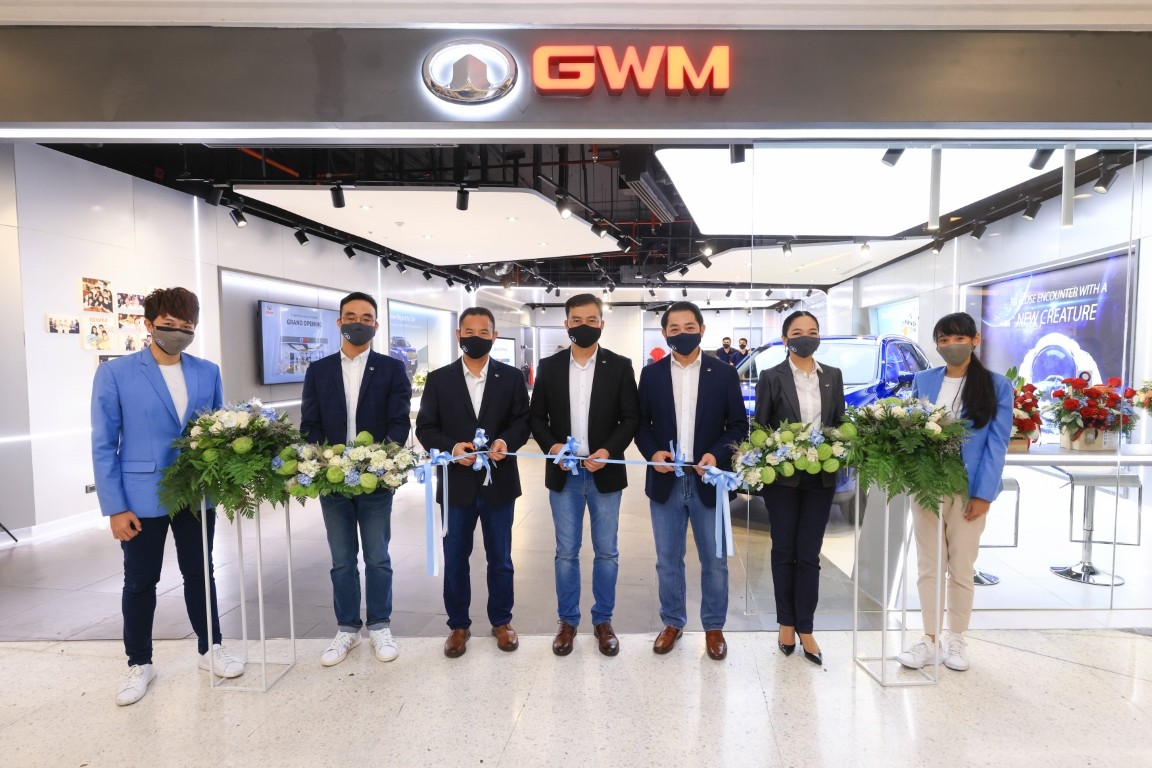
เกรท วอลล์ มอเตอร์ เผยโฉม GWM Store แห่งแรกของโลกในประเทศไทยที่ศูนย์การค้าเซ็นทรัลบางนา ซึ่งนับเป็นการเปิดตัว “New Retail Concept” รูปแบบใหม่จาก เกรท วอลล์ มอเตอร์ เป็นครั้งแรกของโลก ภายใต้กลยุทธ์ New User Experience พร้อมสร้างระบบนิเวศทางธุรกิจแนวใหม่ให้กับอุตสาหกรรมยานยนต์ไทย ด้วยการสร้างประสบการณ์แบบออนไลน์สู่ออฟไลน์ผ่าน GWM Store Partner Store และ GWM Application นับเป็นการยกระดับมาตรฐานการขายและบริการให้กับผู้บริโภคผ่านเพียงปลายนิ้วสัมผัส รวมถึงชูจุดเด่นด้วยการกำหนดราคารถแบบ “ONE PRICE” นอกจากนี้ เกรท วอลล์ มอเตอร์ ยังเตรียมตัวเปิดกิจกรรมการจองรถล่วงหน้า (Pre-Sale) และเปิดตัว All New HAVAL H6 Hybrid SUV พร้อมประกาศราคาอย่างเป็นทางการในเดือนมิถุนายนนี้ เพื่อตอบรับกระแสความต้องการของผู้บริโภคชาวไทย
การเปิดตัว GWM Store แห่งแรกจาก เกรท วอลล์ มอเตอร์ ได้สร้างการเปลี่ยนแปลงครั้งสำคัญที่จะพลิกโฉมตลาดรถยนต์ในไทย ด้วยแผนการดำเนินธุรกิจรูปแบบใหม่ “New Retail Concept” แบบ O2O (Online-To-Offline) ภายใต้กลยุทธ์ New User Experience โดยประเทศไทยจะเป็นประเทศแรกในโลกที่จะนำรูปแบบการทำธุรกิจนี้มาประยุกต์ใช้ เพื่อมุ่งเน้นให้ผู้บริโภคได้รับบริการและความพึงพอใจสูงสุด ได้แก่ 1) Best Choice: ลูกค้าต้องเป็นผู้เลือกสิ่งที่ดีที่สุดได้ด้วยตัวเอง 2) Transparency: ลูกค้าต้องได้รับการนำเสนอผลิตภัณฑ์และบริการที่โปร่งใส ตรงไปตรงมา และ 3) Happiness & Loyalty: ลูกค้าจะต้องมีความสุขและประสบการณ์ที่ดีกับแบรนด์ตลอดการเป็นเจ้าของ และพร้อมที่จะส่งมอบความสุขนี้ให้กับผู้อื่นด้วยการบอกต่อ โดยรูปแบบการดำเนินธุรกิจแบบใหม่นี้ ผู้บริโภคสามารถสร้างประสบการณ์ส่วนตัวตั้งแต่การค้นหาข้อมูล การทดลองขับ การจองรถ การจ่ายเงิน การรับบริการหลังการขาย ทุกอย่างผ่าน GWM Application ซึ่งเพิ่มความสะดวกสบาย ความเป็นส่วนตัว และการจดจำข้อมูลทุกอย่างผ่านเพียงอุปกรณ์สื่อสารและปลายนิ้วสัมผัส
นายณรงค์ สีตลายน กรรมการผู้จัดการ เกรท วอลล์ มอเตอร์ ประเทศไทย เผยว่า “ธุรกิจรูปแบบใหม่ของเรา เกิดจากการลงไปศึกษาความต้องการที่แท้จริงของผู้บริโภคในทุกมิติ ทั้งปัญหาและอุปสรรคต่างๆ ที่ลูกค้าต้องเผชิญในระหว่างกระบวนการขายและบริการ รวมถึงการสัมภาษณ์เจ้าของธุรกิจและผู้จัดจำหน่าย เพื่อหาแนวทางร่วมในการตอบโจทย์ความต้องการของผู้บริโภคให้มีประสิทธิภาพมากยิ่งขึ้นผ่านกระบวนการ “Design Thinking” จนสามารถออกแบบการมอบประสบการณ์แบบ O2O ที่ดีที่สุดให้กับผู้บริโภค เพราะหนึ่งในหัวใจสำคัญในการทำงานของเราคือหลักการ User-centric หรือลูกค้าคือศูนย์กลางสำคัญ ดังนั้น รูปแบบธุรกิจของเราจึงไม่ใช่เป็นเพียงการขายรถยนต์ แต่ยังครอบคลุมถึงการให้บริการในทุกๆ ด้านกับลูกค้าของเรา หรือ Product as a service (PAAS) ซึ่งรูปแบบธุรกิจใหม่นี้ จะเป็นการนำเอาเทคโนโลยี แพลตฟอร์ม และการสร้างประสบการณ์รูปแบบใหม่ให้กับลูกค้าอย่างที่ไม่เคยมีมาก่อน เพื่อช่วยยกระดับความสะดวกสบายและสร้างความพึงพอใจให้กับลูกค้าได้อย่างยอดเยี่ยมยิ่งขึ้น ไม่ว่าจะเป็นการเลือกซื้อรถ การทดลองขับ การตัดสินใจซื้อรถ รวมไปถึงการบริการหลังการขาย ซึ่ง GWM Store ของเรา ไม่ได้เป็นเพียงแค่โชว์รูมรถ แต่เราอยากให้ที่แห่งนี้เป็นเหมือนพื้นที่ลูกค้าของเราสามารถมาทำกิจกรรมที่ชื่นชอบและพัฒนาความคิดสร้างสรรค์ต่างๆ ได้อย่างเต็มที่ พร้อมกับซึมซับและมีประสบการณ์กับแบรนด์และผลิตภัณฑ์ของเราอย่างเป็นธรรมชาติ สร้างความรู้สึกเป็นมิตรและผ่อนคลาย ผ่านการออกแบบฟังก์ชั่นและประสบการณ์ของร้านอย่างลงตัว โดยคอนเซ็ปต์นี้จะนำไปประยุกต์ใช้กับ Partner Store ที่เราร่วมเปิดกับพันธมิตรทางธุรกิจของเราเช่นกัน นอกจากนี้ เรายังมีการพัฒนา GWM Application เพื่อให้ผู้บริโภคของเราไม่พลาดทุกข่าวสารและสามารถเข้าถึงทุกบริการของเราได้โดยง่ายจากเพียงปลายนิ้วสัมผัสบนอุปกรณ์เครื่องโปรด รวมไปถึงการเปิดตัวแพลตฟอร์ม e-Commerce ในอนาคต ที่จะมาช่วยอำนวยความสะดวกในทุกๆ การทำธุรกรรมของ เกรท วอลล์ มอเตอร์ ให้เป็นไปอย่างราบรื่นและสะดวกสบายที่สุด ซึ่งทั้งหมดนี้ จะช่วยสร้างความสะดวกสบายและเชื่อมโยงทุกๆ กิจกรรมระหว่าง รถ-ลูกค้า-ไลฟ์สไตล์-การบริการไว้ด้วยกันอย่างสมบูรณ์แบบ ภายใต้แพลตฟอร์มของ เกรท วอลล์ มอเตอร์”
(จากซ้ายไปขวา)สตีเฟ่น หวัง รองประธาน เอลเลียต จาง ประธาน เกรท วอลล์ มอเตอร์ ภูมิภาคอาเซียนและประเทศไทย และณรงค์ สีตลายน กรรมการผู้จัดการ เกรท วอลล์ มอเตอร์ ดำเนินธุรกิจผ่านเครือข่าย 2 รูปแบบ ได้แก่ GWM Store และ Partner Store โดยตั้งเป้าหมายที่จะเปิด GWM Store ซึ่งลงทุนและดำเนินการโดย เกรท วอลล์ มอเตอร์ รวมไปถึง Partner Store ที่เปิดร่วมกับพันธมิตรทางธุรกิจ รวมทั้งสิ้น 30 แห่ง ภายในสิ้นปี ซึ่งในครึ่งปีแรกนี้ เกรท วอลล์ มอเตอร์ ได้บรรลุเป้าหมายดังกล่าวเป็นที่เรียบร้อยแล้ว โดยยืนยันว่าจะมีการเปิด GWM Store 10 แห่ง และ Partner Store 20 แห่ง รวมถึงร้านและสาขาอื่นๆ ที่จะตามมาเพิ่มเติมภายในครึ่งปีหลัง ทั้งนี้ภายในเดือนมิถุนายนนี้ เกรท วอลล์ มอเตอร์ จะมีการเปิดตัว GWM Store เพิ่มอีก 2 สาขาอย่างเป็นทางการ คือ สาขาฟิวเจอร์ พาร์ค รังสิต และสาขาสีลม คอมเพล็กซ์ พร้อมวางแผนที่จะเปิด GWM Experience Center ณ ศูนย์การค้าไอคอนสยาม รวมถึง Flagship Service Center ในไตรมาส 3 นี้อีกด้วย
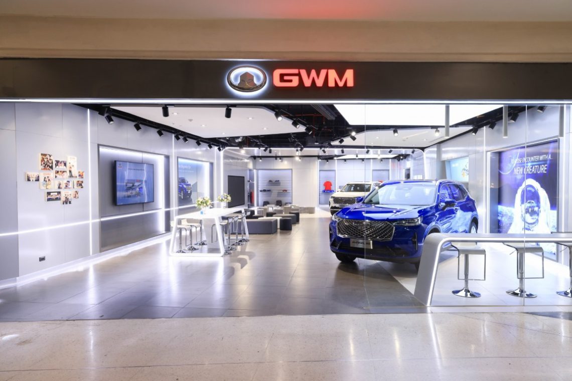
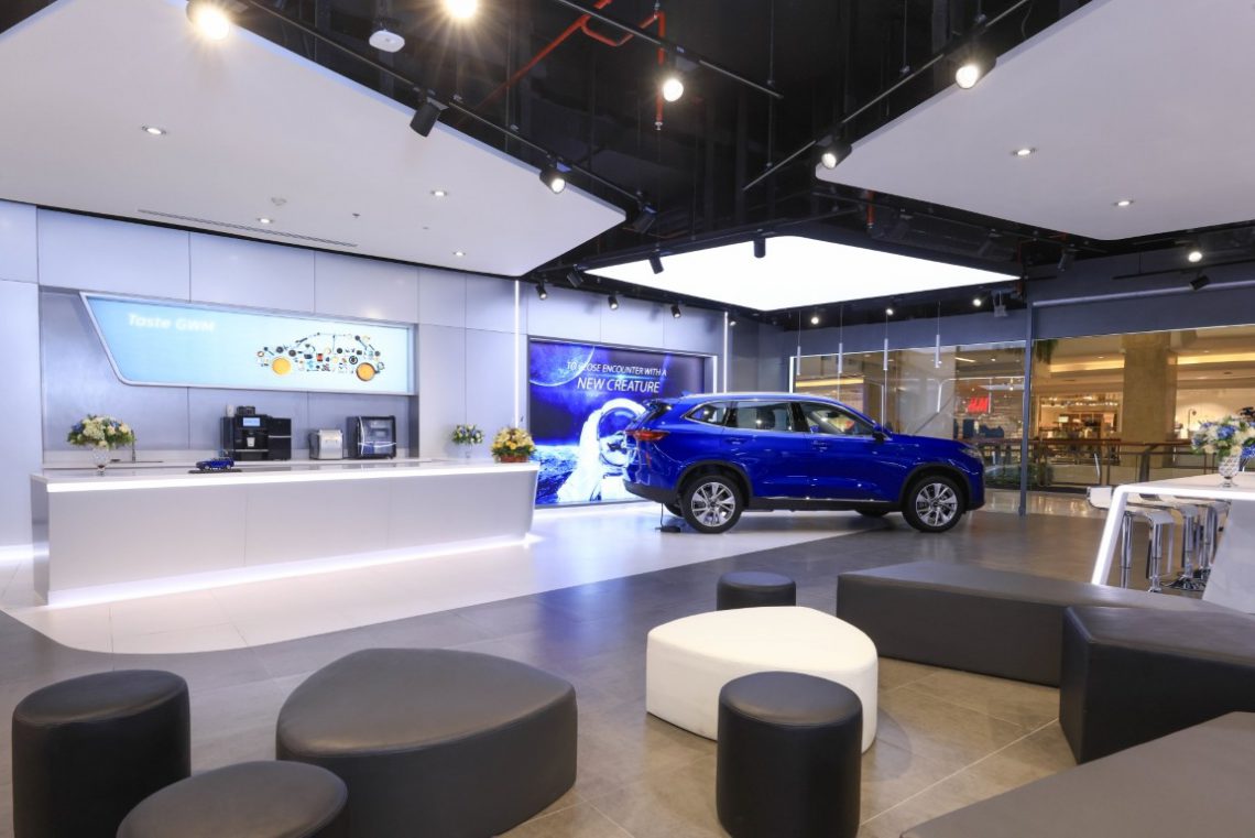
นางสาวปิยะนุช จตุรภัทร์ ผู้อำนวยการฝ่ายขาย เกรท วอลล์ มอเตอร์ ประเทศไทย กล่าวว่า “GWM Store โดดเด่นด้วยการออกแบบพื้นที่และฟังก์ชั่นการใช้งานที่เหมาะสำหรับการสร้างประสบการณ์และช่วงเวลาที่ดีที่สุดให้กับผู้บริโภค ด้วยแนวคิด User Lifestyle Space ทำให้ทั้ง GWM Store และ Partner Store ไม่เป็นเพียงแค่โชว์รูมรถยนต์สำหรับจัดแสดงและซื้อขายรถยนต์หรือสินค้า Merchandise ต่างๆ เท่านั้น แต่ยังเป็นพื้นที่ที่ให้ลูกค้าสามารถออกแบบกิจกรรมของตัวเอง โดยมีน้อง iAm (GWM Intelligent Ambassador) และ CA (Customer Assistant) คอยอำนวยความสะดวก ให้คำปรึกษา และดูแลลูกค้าประดุจครอบครัว พร้อมพื้นที่สำหรับกิจกรรมต่างๆ ที่เปิดกว้างให้ผู้บริโภคสามารถ Walk-in เข้ามาใช้งาน เรียนรู้และสร้างประสบการณ์ที่ดีไปด้วยกันกับ เกรท วอลล์ มอเตอร์ได้อย่างสะดวกสบาย ไม่ว่าจะเป็น Co-Working Space สำหรับนั่งอ่านหนังสือหรือทำงาน พื้นที่สำหรับพักผ่อนหย่อนใจ Coffee Bar หรือพื้นที่สำหรับการจัด Mini workshop ต่างๆ เป็นต้น ทั้งนี้ เกรท วอลล์ มอเตอร์ คำนึงถึงความสำคัญของผู้บริโภคของเราอยู่เสมอ เราจึงอยากจะให้ GWM Store เป็นอีกหนึ่งช่องทางที่จะทำให้กลุ่มลูกค้าและแฟนๆ ของเรา มีความรู้สึกผูกพันและต้องการที่จะ “Go With Me” ก้าวเดินไปด้วยกัน และพร้อมที่จะเติบโตไปกับเกรท วอลล์ มอเตอร์ ในอนาคต รวมไปถึงเปิดโอกาสในการสร้างความสัมพันธ์ที่แน่นแฟ้น ได้ทำความรู้จักและเข้าใจความต้องการของผู้บริโภคอย่างลึกซึ้ง และเกิดความร่วมมืออันดีระหว่างกันในอนาคต”
ในส่วนของ Partner Store จะมีการออกแบบพื้นที่ คอนเซ็ปต์ และฟังก์ชั่นการใช้งานที่ใกล้เคียงกันกับ GWM Store แต่จะเป็นการพลิกโฉมและให้คำนิยามใหม่ให้กับพันธมิตรทางธุรกิจของ เกรท วอลล์ มอเตอร์ ที่จะไม่ได้เป็นเพียงดีลเลอร์หรือผู้แทนจำหน่ายอีกต่อไป แต่จะมาร่วมเป็นพาร์ทเนอร์หรือหุ้นส่วนธุรกิจในการเป็น “ผู้ให้บริการ” ที่พร้อมส่งมอบประสบการณ์ที่ดีที่สุดให้กับผู้บริโภคและลูกค้าของ เกรท วอลล์ มอเตอร์ อย่างแท้จริง
ในส่วนของกลยุทธ์ด้านการบริการหลังการขาย นายศราวุฒิ บรรยงค์กุล ผู้อำนวยการฝ่ายบริการหลังการขาย เกรท วอลล์ มอเตอร์ ประเทศไทย กล่าวว่า “นอกจากบริการด้านการขายแล้วนั้น งานบริการหลังการขายถือเป็นหัวใจสำคัญในการสร้างประสบการณ์ที่ดีให้กับผู้บริโภคเป็นอย่างมาก ซึ่งในส่วนของบริการหลังการขายของ เกรท วอลล์ มอเตอร์ มีความมุ่งมั่นที่จะตอบโจทย์ไลฟ์สไตล์ของผู้บริโภคในยุคดิจิทัลให้ได้รับความสะดวก รวดเร็ว ประหยัดเวลา และสามารถเติมเต็มความต้องการด้านต่างๆ ได้แบบครบวงจรตลอด 24 ชั่วโมงเพื่อให้ลูกค้าของเราอุ่นใจและไร้กังวล ด้วยรูปแบบการให้บริการแบบ “Premium Service at Your Fingertips” ผ่าน 4 กลยุทธ์หลัก ได้แก่
Connected Car Ecology : เชื่อมต่อทุกระบบนิเวศของรถไว้ด้วยกัน ทั้งตัวรถ ลูกค้า ศูนย์บริการ และ เกรท วอลล์ มอเตอร์ เพื่อให้ผู้บริโภคไม่พลาดทุกการเชื่อมต่อข้อมูลข่าวสาร การบริการ และความบันเทิงทุกรูปแบบจาก เกรท วอลล์ มอเตอร์ ไม่ว่าจะเป็นระบบการจัดการข้อมูล ระบบควบคุมและสั่งงานตัวรถ ระบบ Infotainment การค้นหาข้อมูล การจองและใช้บริการต่างๆ ได้อย่างสะดวกสบายจากเพียงปลายนิ้วสัมผัส อาทิ การค้นหาศูนย์บริการและการนำทาง หรือการให้บริการผ่านทาง GWM Application ทั้งการจองและการแจ้งเตือนเข้ารับบริการ การประเมินค่าบริการเบื้องต้น การเรียกรถช่วยเหลือฉุกเฉิน การจองการรับรถและส่งรถ การจ่ายค่าบริการออนไลน์ หรือแม้แต่การเช็คสถานะการซ่อม ทุกอย่างสามารถทำได้ง่ายดายผ่านแอปพลิเคชั่น24 Hrs / 7 Day Response : การให้บริการของระบบ GWM Contact Center แบบ 24/7 ทั้ง 7 วัน ตลอด 24 ชั่วโมง เพื่อให้มั่นใจได้ว่า ทุกๆ คำถาม ทุกๆ ปัญหาของผู้บริโภคของเกรท วอลล์ มอเตอร์ ได้รับความใส่ใจ และได้รับการช่วยเหลืออย่างเต็มที่และทันท่วงที ทั้งทางช่องทางผ่านระบบโทรศัพท์ และช่องทางโซเชียลมีเดียต่างๆ ของ GWMTransparency Data : การทำงานและการให้บริการที่โปร่งใส ซื่อสัตย์กับผู้บริโภค ด้วยระบบการจัดการข้อมูลแบบ ONE Single Service Data Management System เพื่อให้มั่นใจได้ว่า ทุกๆ ข้อมูลในระบบมีความถูกต้อง แม่นยำ อัพเดทแบบเรียลไทม์ และเข้าถึงได้ด้วยชุดข้อมูลที่ตรงกันทั้งหมด รวมถึงประวัติการซ่อมและการเข้ารับบริการของลูกค้าทุกคนจากทุกๆ ช่องทางและศูนย์บริการของ เกรท วอลล์ มอเตอร์ ทำให้ลูกค้าสามารถเข้ารับบริการได้จากทุกที่ เช็คสถานะการซ่อมผ่านระบบข้อมูลกลาง อนุมัติงานซ่อมและงานบริการได้แบบเรียลไทม์ผ่าน GWM Application ทำให้โปร่งใส ฉับไว และมีประสิทธิภาพสูงสุดConvenience Service : อำนวยความสะดวกสบายถึงขีดสุดด้วยบริการที่ส่งตรงถึงบ้านคุณจากศูนย์บริการของเกรท วอลล์ มอเตอร์ ที่อยู่ใกล้คุณมากที่สุด โดยสามารถเรียกใช้บริการ ไม่ว่าจะเป็นการเช็คสภาพรถ การเช็คระยะ หรือบริการอื่นๆ พร้อมติดตามความคืบหน้าและทราบผลการบริการได้อย่างสะดวกสบาย รวมถึงบริการรับ-ส่งรถเพื่อเข้ารับบริการ เพิ่มความสะดวกสบายให้กับลูกค้าของเกรท วอลล์ มอเตอร์ในทุก ๆ มิติการบริการไม่ว่าจะอยู่ที่ใดทั้งนี้ เกรท วอลล์ มอเตอร์ มีแผนเตรียมเปิดตัว GWM Application ที่เป็นหัวใจหลักของรูปแบบการดำเนินธุรกิจแบบใหม่ผ่านระบบ O2O ที่จะช่วยให้ผู้บริโภคไม่พลาดทุกข้อมูลข่าวสารอัพเดทล่าสุดจาก เกรท วอลล์ มอเตอร์ รวมถึงการรับบริการด้านการขายและบริการหลังการขาย ทั้งก่อนและหลังจากเป็นเจ้าของรถ นอกจากนี้ ผู้บริโภคยังสามารถใช้ฟังก์ชั่นต่างๆ ในแอปพลิเคชั่นเพื่อเชื่อมประสบการณ์การชอปปิ้งตามไลฟ์สไตล์ของตนผ่าน Brand Store ที่ทางเกรท วอลล์ มอเตอร์ เลือกสรรมาให้ ผ่านการใช้ระบบ Point System โดย GWM Application ยังสามารถเชื่อมต่อกับระบบ Telematic และแพลตฟอร์มของรถได้ ไม่ว่าจะเป็นระบบเครือข่ายอินเทอร์เน็ตค้นหาข้อมูล ดูหนังฟังเพลงและเอ็นเตอร์เทนเมนต์ต่างๆ รวมไปถึงการค้นหาตำแหน่งและเนวิเกเตอร์นําทาง การตรวจสอบสถานการณ์บำรุงรักษารถยนต์ เป็นต้น
นอกจากนี้ เกรท วอลล์ มอเตอร์ ยังเตรียมเปิดตัว แพลตฟอร์ม e-Commerce เพื่อเสริมธุรกิจยานยนต์ให้แข็งแกร่งยิ่งขึ้น ด้วยการให้บริการด้านการเงิน และการทำธุรกรรมต่างๆ ตั้งแต่ขั้นตอนการจองและทดลองขับแบบออนไลน์ที่สโตร์ใกล้บ้าน, ไปจนถึงกระบวนการซื้อรถ ที่สามารถประเมินค่าใช้จ่าย ตรวจสอบแพคเกจการรับประกันและยื่นไฟแนนซ์ การชำระเงินออนไลน์ รวมถึงการส่งมอบรถยนต์ถึงหน้าบ้านได้อย่างสะดวกสบาย โดยไม่ต้องเสียเวลาเดินทาง
เกรท วอลล์ มอเตอร์ พร้อมแล้วที่จะสร้างความประทับใจและความเชื่อมั่นให้กับลูกค้าในการเป็นเจ้าของรถ เกรท วอลล์ มอเตอร์ ไม่ว่าจะเป็นนโยบายการขยายเครือข่ายผ่าน GWM Store และ Partner Store ทั่วประเทศการรับประกันและรูปแบบของแพคเกจเซอร์วิสต่างๆ ที่จะเป็น Best-in-Class และ First-in-Class ให้ลูกค้าหมดกังวลกับการใช้รถและการดูแลรักษาระยะยาว รวมไปถึงเซอร์ไพรส์แคมเปญสำหรับลูกค้าคนพิเศษในการเปิดรับจองรถ All New HAVAL H6 Hybrid SUV ในวันที่ 15 มิถุนายนนี้ และการเปิดตัวรวมถึงประกาศราคาอย่างเป็นทางการวันที่ 28 มิถุนายน ที่จะมาพร้อมจุดเด่นด้วยการกำหนดราคารถแบบ “ONE PRICE” คือ ราคาเดียว เท่ากันในทุกๆ ช่องทางการขายของ เกรท วอลล์ มอเตอร์ ผ่านระบบ GWM Application ที่รวบรวมทุกบริการอยู่ภายใต้ปลายนิ้วสัมผัส
เกรท วอลล์ มอเตอร์ ในฐานะ “บริษัทที่ให้บริการการขับเคลื่อนด้วยเทคโนโลยีระดับโลก (Global Mobility Technology Company)” ยังคงมุ่งมั่นที่จะส่งมอบประสบการณ์ที่ดีที่สุดให้แก่ผู้บริโภค และด้วยการนำธุรกิจรูปแบบใหม่ภายใต้กลยุทธ์ New User Experience มามอบให้ผู้บริโภคได้สัมผัสเป็นครั้งแรกของโลกครั้งนี้ เกรท วอลล์ มอเตอร์ พร้อมแล้วที่จะก้าวสู่การเป็น Top of Mind แบรนด์รถยนต์ของคนไทย และช่วยยกระดับมาตรฐานการบริการด้านยานยนต์ให้ไปก้าวไกลไปอีกขั้น เพื่อส่งมอบประสบการณ์ด้านยานยนต์ที่ดีที่สุดให้กับผู้บริโภคชาวไทยและทั่วโลกต่อไปในอนาคต